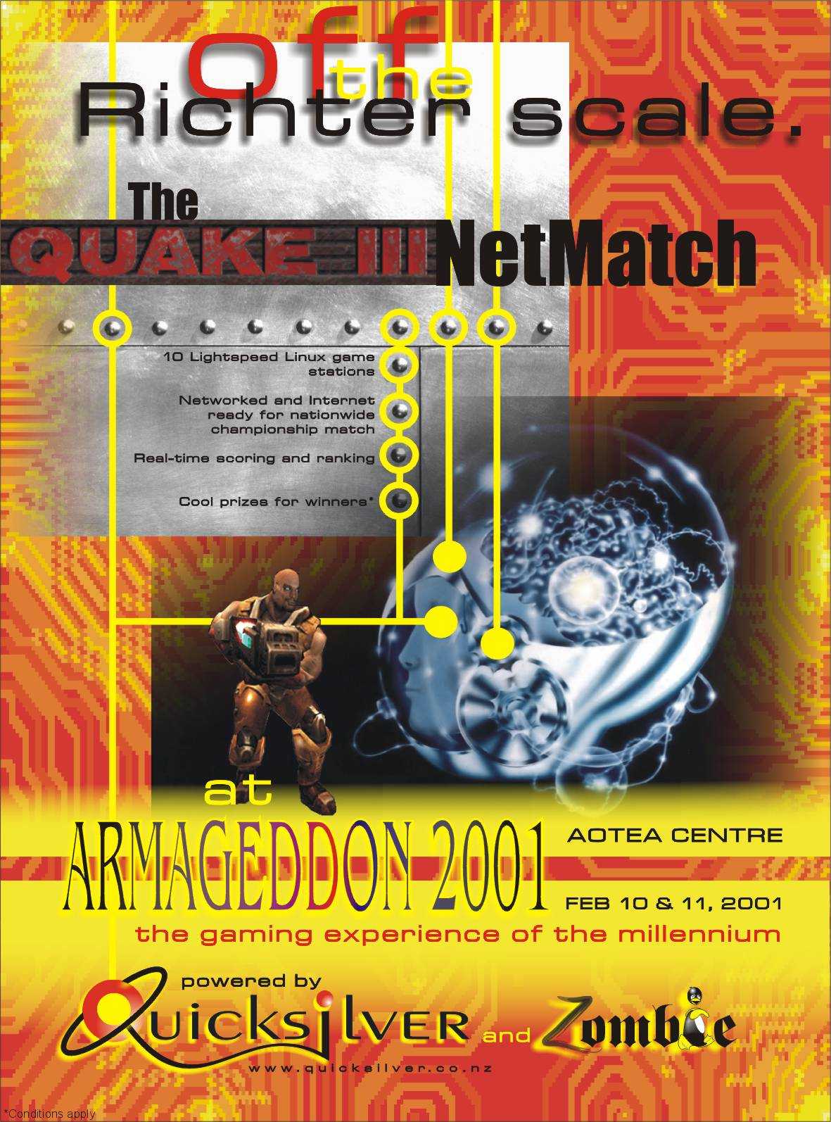
While working for Quicksilver Internet, an ad to promote Quicksilver's sponsorship of a LAN game.
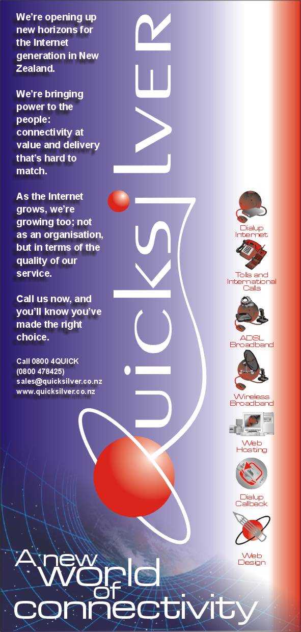
Quicksilver Internet flyer. I also designed the product extension logos.
A logo for my good friend and drummer Glen Rodgers
(www. glenrodgers.com).
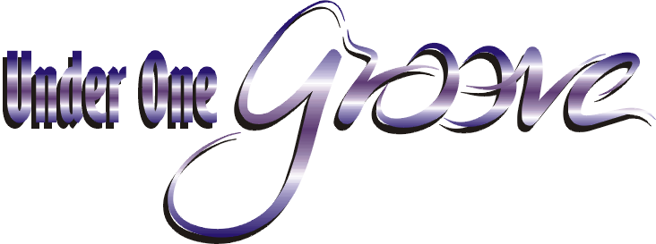
Logo for a soul and funk band that Glen, myself, and guitarist tKris Holmes played for.
My (unsuccesful) design for the Auckland Supercity logo.
RATIONALE
Some thoughts on the concepts behind the logo.
DYNAMISM AND MOVEMENT
I think of Auckland as a dynamic city, a ‘city that never sleeps’. I have a son in University with an active social life, and I often find myself chauffeuring him in and out of the city in the wee hours of the morning. Auckland is always awake, vibrant and full of life, whenever and wherever you may be. I think the logo should reflect that and be dynamic and full of movement too, and shouldn’t have the solid and monolithic feel of a corporate logo at all.
CITY OF SAILS
As an immigrant stepping off the plane into one of the nicest and most welcoming airports in the world into a new home and a new life, this line was the first thing I saw. The concept extended into the architecture, the landscape, the drive into the city, and when we reached our journey’s end on Parnell Rise the harbour was laid out below me. I have grown to love this idea - I think it makes us unique, and I relate to it more than to an amorphous idea like ‘big little city’. It may be a familiar idea - but familiar ideas gain in strength and loyalty and I think they should not be given up on just for the sake of something new. We see water, sun, sea, sand and sails pretty much everywhere we go in Auckland, and I wanted that in my logo too.
A FOR AUCKLAND
The sail idea above has also been worked to be reminiscent of an A, with the crosspiece also serving as a hint of a yacht boom.
SIMPLICITY AND FLEXIBILITY OF USE
This logo is four strokes with a pen. Even though the rendering above is shaded for presentation, a flattened 2 dimensional version will easily lend itself to stationery, business cards, vehicle branding etc - even to more exotic and creative treatments:
Sculpture - I would love to see this logo as a massive mobile like those on the waterfront.
Sail shaped banners and flags.
Fireworks and pyrotechnic art.
Dance - Chinese dance ribbons to trace it in mid performance.

Logos for both the corporate holding company (Mercury) and the principal brand offering of Quicksilver Internet, Auckland.
Logo for Agromarine, a marine agriculture technology company.
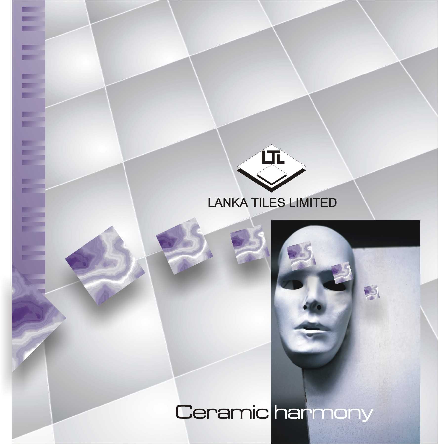
Lanka Tiles is Sri Lanka's foremost tile manufacturing and distribution company. This was their complete catalogue. Printed booklet available for view.
CJN Technologies' company newsletter.
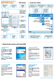
For CJN Technologies, a laminated quick reference guide designed for truck based contractors working out of their vehicles. The guide was designed to fit into a truck sun visor pocket.